Halden Rail
Wayfinding for a railway that crosses a border
- Halden Rail
- 2025
- Mobility
- Brand identity, Wayfinding system, Signage typeface, Motion guidelines
The brief
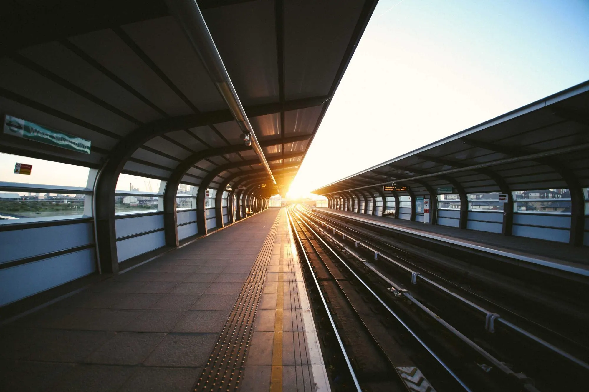
Two national rail systems, two languages and three generations of signage. Passengers changing at the border had to read two different visual languages in the space of one platform.
What we did
We designed one signage typeface with Norwegian and Swedish glyphs drawn together, so both languages set at the same width.
Every sign follows a single rule: direction first, destination second, time third. Nothing else is allowed on a platform sign.
Motion guidelines cover departure boards, the app and in-train screens, so a delay looks the same wherever you see it.

Outcome
The system rolled out across all 41 stations in 14 months. Missed-connection complaints at the border station fell by a third in the first winter.
Outcome
- Stations signed
- 41
- Missed-connection complaints
- -34%
- From first sketch to last sign
- 14 mo
We asked for a logo. We got a way for two countries to share one platform.
Credits
- Creative direction
- Tomás Ferreira
- Type design
- Mireille Okafor
- Motion
- Kenji Arakawa